The Power of Paint: Transforming Spaces with Color Psychology
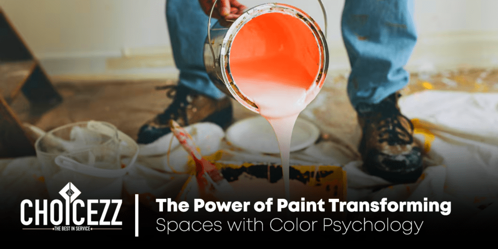
Paint is one of the simplest yet most impactful tools in transforming any space. Beyond aesthetics, the colors we choose for our walls and furniture have a profound effect on mood, behavior, and overall ambiance. This is where the fascinating world of color psychology comes into play. Color psychology delves into how different hues influence human emotions and perceptions. By understanding these principles, you can create spaces that not only look stunning but also evoke the desired feelings and functionalities. Let’s explore how paint colors can revolutionize spaces through the lens of color psychology.
Understanding the Basics of Color Psychology Colors are powerful communicators. Each hue triggers a unique set of emotions and reactions, shaping how individuals perceive their surroundings. For example, warm colors such as red, orange, and yellow are energizing and vibrant, while cool colors like blue, green, and purple exude calmness and serenity. Neutral shades like beige, gray, and white create balance and provide a versatile backdrop. Recognizing these psychological associations is essential for designing spaces that align with their intended purposes.
Warm Colors: Energy and Enthusiasm Warm colors bring energy and enthusiasm to a space, making them ideal for areas where activity and interaction are encouraged. For instance, red, often associated with passion and intensity, is perfect for dining rooms where it stimulates appetite and conversation. However, using too much red can be overwhelming, so consider pairing it with neutral accents. Similarly, orange, linked to creativity and excitement, works well in home offices or playrooms. Yellow, a color of happiness and optimism, brightens up kitchens and living areas, creating an inviting and cheerful atmosphere. These colors are best used in moderation to maintain a balanced look.
Cool Colors: Calm and Relaxation Cool colors are synonymous with tranquility and relaxation, making them popular choices for bedrooms, bathrooms, and meditation spaces. Blue, known for its calming effect, can reduce stress and promote restful sleep when used in bedrooms. It also conveys professionalism and focus, which is why it’s often used in corporate environments. Green, reminiscent of nature, fosters a sense of balance and renewal, making it a great choice for living rooms and home offices. Purple, associated with luxury and creativity, can add an element of sophistication to spaces like dining rooms or libraries. When using cool colors, consider their shades carefully—lighter tones enhance openness, while darker hues create coziness.
Neutral Colors: Versatility and Elegance Neutral colors are the foundation of timeless design. They offer versatility, allowing you to experiment with different textures and accent pieces. White, symbolizing purity and simplicity, is a go-to choice for modern and minimalist designs. It creates an illusion of spaciousness and reflects light beautifully, making small rooms appear larger. Beige and taupe bring warmth and subtle elegance, blending seamlessly with other colors. Gray, a contemporary favorite, ranges from light silver to deep charcoal, adding sophistication and depth to interiors. Black, while bold, is an excellent accent color that highlights architectural details and adds contrast.
Accent Colors: Adding Personality While primary wall colors set the tone for a space, accent colors inject personality and vibrancy. An accent wall painted in a bold hue, such as teal or coral, can serve as a focal point, drawing attention to specific areas like a fireplace or headboard. Additionally, accent colors can be introduced through furniture, artwork, or decorative items, offering flexibility to change the look without repainting entire walls. The key is to choose colors that complement the primary palette while reflecting your unique style.
Using Paint to Define Space and Functionality Color psychology extends beyond mood enhancement; it also helps define the functionality of spaces. For instance, in open-concept layouts, paint can be used to delineate different zones without physical barriers. A kitchen painted in warm tones can flow seamlessly into a cooler-toned living area, creating visual distinction while maintaining harmony. Similarly, painting ceilings a slightly lighter shade than the walls can add height to a room, while darker ceilings create a cozier feel.
Cultural and Personal Influences on Color Choice Cultural and personal preferences significantly influence how colors are perceived. For example, in Western cultures, white is often associated with weddings and purity, while in some Eastern cultures, it is linked to mourning. Understanding these nuances is crucial when designing multicultural spaces. Personal experiences and tastes also play a role in color selection; a color that evokes joy for one person may be unsettling for another. Consulting with a professional interior designer can help tailor color choices to your unique needs and preferences.
The Role of Lighting in Color Perception Lighting plays a pivotal role in how paint colors appear. Natural light, artificial lighting, and the direction of the light source can alter a color’s tone and intensity. For instance, a soft gray may look cool and sophisticated in natural daylight but may appear warmer under yellow-tinted artificial lights. When selecting paint colors, test samples in various lighting conditions to ensure they achieve the desired effect. Layering lighting with ambient, task, and accent lights further enhances the interplay of colors in a space.
Eco-Friendly Paints: A Sustainable Choice With growing environmental awareness, eco-friendly paints have become increasingly popular. These paints are low in volatile organic compounds (VOCs), reducing harmful emissions and improving indoor air quality. Available in a wide range of colors, eco-friendly paints offer a sustainable option for creating beautiful interiors without compromising health or the planet.
Transforming Spaces: Case Studies and Success Stories The transformative power of paint is evident in numerous real-life examples. A cramped studio apartment painted in soft, neutral tones instantly feels more spacious and inviting. A drab office space brought to life with energizing yellows and greens boosts productivity and morale. A family room with an accent wall in deep blue creates a cozy, intimate gathering place. These success stories highlight how thoughtful color choices can enhance both aesthetics and functionality.
Practical Tips for Choosing and Applying Paint 1. Start Small: Experiment with smaller areas like bathrooms or accent walls before committing to a full-scale project. 2. Use Color Swatches: Test paint samples on your walls to see how they look in different lighting conditions. 3. Invest in Quality Paint: High-quality paints offer better coverage, durability, and vibrancy. 4. Hire Professionals: For complex designs or large projects, professional painters can achieve flawless results. 5. Maintain Your Walls: Regular cleaning and touch-ups keep your paint looking fresh and vibrant.
Conclusion: Let Choicezz Bring Your Vision to Life Paint is more than just a decorative element; it’s a powerful tool for creating spaces that inspire, relax, and energize. By leveraging the principles of color psychology, you can design interiors that reflect your personality and serve your practical needs. At Choicezz, we specialize in helping clients unlock the full potential of their spaces with expert painting services and guidance. Whether you’re revamping a single room or transforming an entire home, our team is dedicated to delivering excellence. Contact us today to bring your vision to life!